
5 Ways To Design Holiday Print That Doesn’t Blend In
Holiday print fills mailboxes fast, and most of it looks the same. You see the usual red and green, the same phrases, and the same folded cards. When you’re sending something at the holidays, you want it to feel intentional and worth keeping.
You don’t need a big budget to make this happen. A few smart design choices make your message sharper and more memorable. Start with these five ideas.
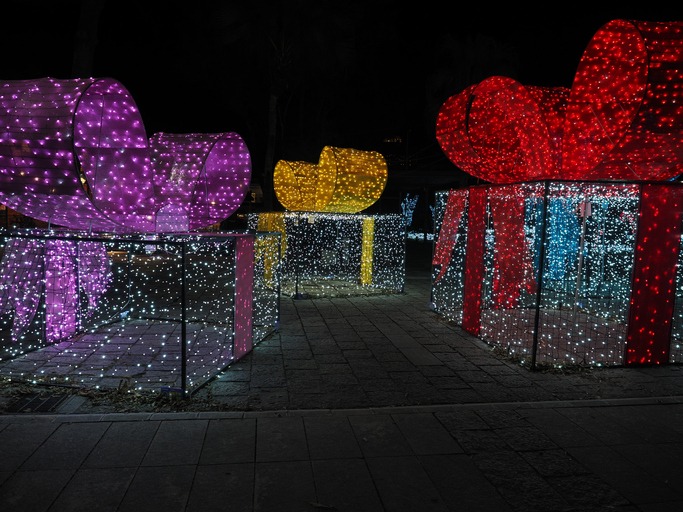
Traditional palettes make your piece blend in. Switching the colors makes people notice.
Try:
- Navy and silver
- Plum and gold
- Teal or copper accents
Pair one unexpected color with a metallic or textured finish for a simple, modern look.
Custom Printing
2. Make the Message Personal
Generic greetings feel like mass mail. People respond to messages that sound direct and real.
Examples:
- “Your support helped us grow this year, and we look forward to serving you in 2026.”
- For nonprofits: “Your generosity helped 42 families enjoy a Thanksgiving meal.”
A short, specific message creates more connection than a long, vague paragraph.
Direct Mail Services
3. Break the Format Rules
A standard folded rectangle disappears in a pile. Mix up the shape or size to stand out.
Formats you can run quickly at Graphic Solutions Group:
- Square cards
- Oversized postcards
- Flat cards with bold front-side messaging
- Simple die cuts
Your goal is simple: create something that makes people pause when they pull it from the mailbox.
Dielines & Templates
4. Add Texture or Shine
People remember how a printed piece feels. Tactile elements win attention fast.
Options:
- Heavy cover stock
- Soft-touch coating
- Foil accents
- Spot UV
- Embossing or debossing
- Textured papers
These finishes add dimension without slowing down production.
5. Keep It On Brand
Holiday print works best when it looks like you, not like a template.
Your brand voice should lead the design.
Guidelines:
- Playful brands can use simple humor or illustrations.
- Professional brands look sharp with clean layouts and one strong accent color.
- Bold brands can lean into oversized type or minimalist graphics.
You want your message to feel familiar, direct, and authentic..
Make This Year’s Message Count
Holiday print gives you a chance to thank customers and reinforce your brand. Break out of the usual color choices, personalize the message, and choose a format that looks fresh. These simple moves help your holiday print stand out and get remembered.
If you want ideas you can still get out fast, Graphic Solutions Group can help with quick-turn holiday print that makes an impact.
Contact Us
Contact Us for More Information
Are you looking for a printer who can help you meet your deadlines?
Then your in the right place! Have any questions or concerns we would love to hear from you.
Please submit your information in this form and a sales professional will reach out to you.
Want to Speak to a Sales Representative? Call 770-424-2300