
Call-to-Action Mistakes That Might Be Hurting Your Response Rates
You launched the campaign.
The email went out. The banners were printed. The postcards hit the mail.
Then nothing much happened.
No spike in website traffic. No rush of signups. Maybe a few clicks, but not enough to make anyone feel good about the results.
Before you blame the design, the mailing list, the offer, or the timing, look at one line first:
What exactly did you ask people to do?
That line is your call to action, or CTA. It is where the campaign either moves someone forward or lets them walk away.
Too many businesses treat the CTA like an afterthought. They spend time on the design, copy, audience, print quality, and placement, then finish with something weak like “Learn more” or “Contact us.”
That can kill response.
Here are seven common call-to-action mistakes that hurt response rates, plus better ways to fix them.
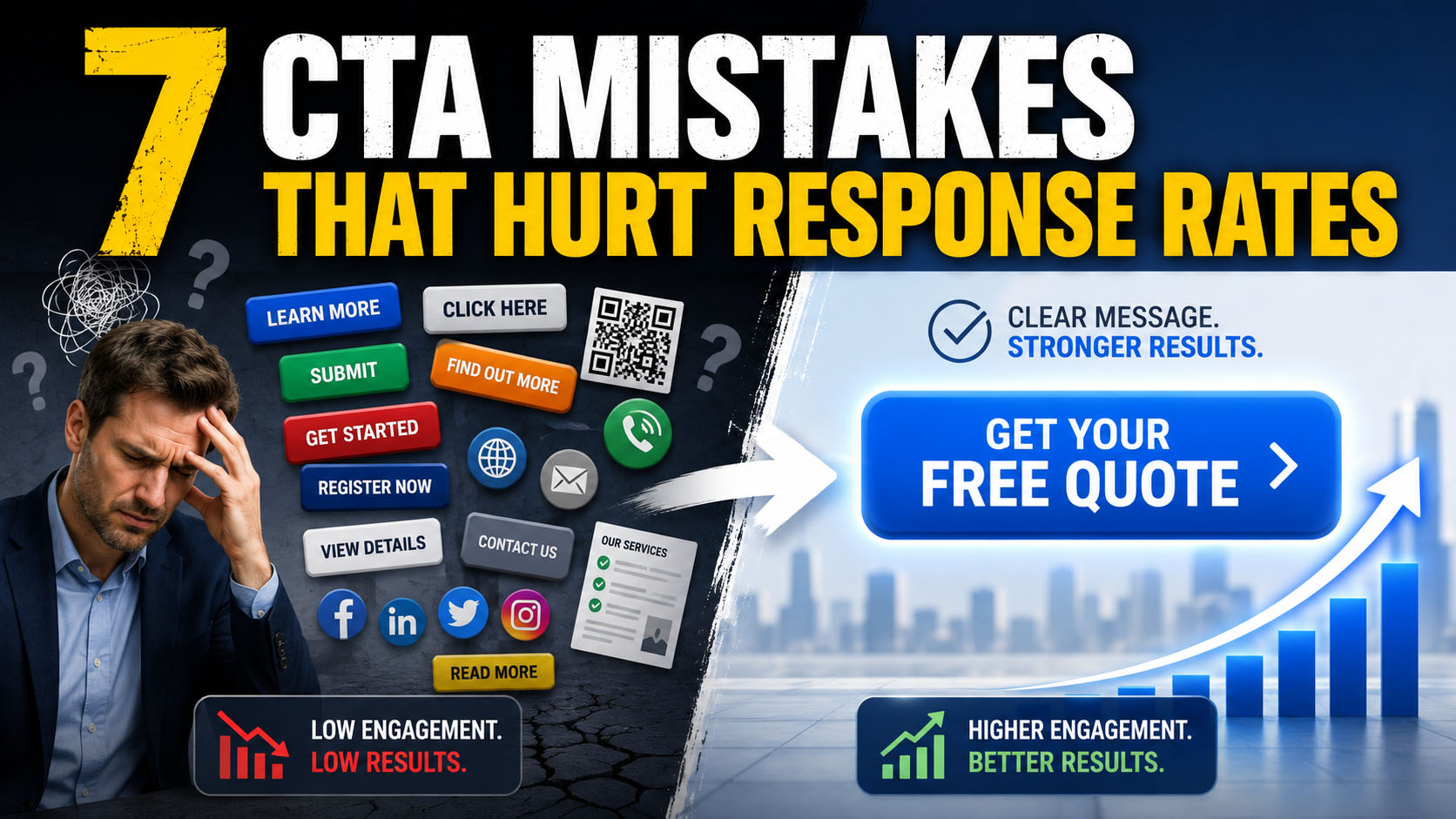
1. Your CTA Is Too Passive
One of the biggest call-to-action mistakes is playing it too safe.
You have seen these CTAs everywhere:
- Learn more
- Click here
- Contact us
- Submit
- Read more
They are polite. They are common. They are also easy to ignore.
A passive CTA does not create action. It gives the reader permission to move on.
The problem is simple: there is no clear reason to act. The reader does not know what they get. They do not feel any urgency. They do not see a next step that feels worth taking.
A stronger CTA tells people what to do and why it matters.
Instead of:
Learn more
Try:
See upcoming event dates
Instead of:
Contact us
Try:
Let’s plan your next event
Instead of:
Click here
Try:
Get your free estimate
You do not need to be pushy. You need to be clear. People respond better when the next step feels useful, specific, and easy.
2. You Give People Too Many Choices
More options do not always help. In marketing, they often hurt.
This happens all the time in print and digital campaigns. You add a QR code, website, phone number, email address, social media icons, store hours, a hashtag, and maybe a second offer because you do not want to leave anything out.
That may feel complete, but to the reader it feels like clutter.
When people see too many choices, they often make no choice at all.
A strong CTA has one job.
One step.
One goal.
One clear action.
That does not mean you can’t include supporting information elsewhere. You can. But the main call to action should point people to the most important next step.
For example, do not say:
Visit our website, call us, scan the QR code, follow us online, or stop by today.
Say:
Scan the QR code to schedule your free consultation.
That gives the reader a clear path. It removes the guesswork.
3. Your CTA Sounds Like Everyone Else’s
Generic CTAs are easy to write. That is also why everyone uses them.
- Shop now
- Download
- Submit
- Learn more
- Sign up
They work in some cases, but they rarely create much interest by themselves.
Your audience has seen those words hundreds of times. When your CTA sounds like every other button, postcard, sign, or email, your message blends in.
A better approach is to write the CTA in a way that matches what the reader wants.
Instead of:
Download now
Try:
Send me the checklist
Instead of:
Shop now
Try:
Show me the best options
Instead of:
Register
Try:
Save my seat
This works because the CTA feels like the reader’s decision, not your command.
Before you approve your next CTA, ask one question:
Would a real person actually say this?
If not, rewrite it.
4. The CTA Shows Up at the Wrong Time
A good CTA can still fail if it shows up at the wrong moment.
Sometimes a campaign builds interest, explains the offer, creates a reason to act, then ends with a flat CTA that does not match the message.
That kills momentum.
Your CTA should match the point where the reader is most ready to act.
If your message creates urgency, use a CTA that supports urgency:
Spots are limited. Reserve yours today.
If your message builds trust, use a CTA that starts a conversation:
Let’s talk about your next project.
If your message creates curiosity, use a CTA that invites the next step:
See what’s coming next week.
This applies to email, direct mail, landing pages, banners, brochures, and signs. The CTA should feel like the natural next step, not something pasted at the bottom because the layout needed a button.
5. Your Button Text Is Weak
A button is not just a design element. It is a decision point.
That button text matters.
Too many buttons say things like:
- Submit
- Click here
- Download
- Continue
Those words tell people what the button does, but they do not sell the action.
Better button copy tells people what they are getting.
Instead of:
Download
Try:
Get my marketing checklist
Instead of:
Submit
Try:
Request my quote
Instead of:
Shop now
Try:
Find my best option
This matters even more on landing pages, emails, online forms, and QR code campaigns. If someone scans a QR code from a printed piece, the button or landing page CTA needs to finish the job.
The click is not the goal. The decision is the goal.
6. There Is No Urgency
Most people do not ignore your marketing because they hate the offer.
They ignore it because they do not feel a reason to act right now.
Without urgency, even a good CTA can feel optional.
Urgency does not mean flashing red text, fake countdown timers, or pressure tactics. It means helping people understand why now matters.
There are two types of urgency.
Hard urgency
uses real limits:- Registration closes Friday
- Only 25 spots available
- Offer ends June 30
- Limited inventory available
Soft urgency
connects to timing, need, or opportunity:- Start the season strong
- Get ready before the rush
- Plan your project before deadlines hit
- Schedule now before production fills up
Examples:
Only 3 days left to register
First 25 customers receive early access
Fall sessions are filling fast. Book today.
Start the season strong. Schedule your intro call.
Good urgency helps people prioritize. It does not need to pressure them.
7. You Treat the CTA Like an Afterthought
Every marketing piece is working toward one thing: a decision.
That is true for postcards, emails, flyers, banners, websites, trade show graphics, direct mail, and social ads.
The CTA is not a small detail at the end. It is the point of the campaign.
If you are not getting the response you want, the problem may not be the design, audience, offer, or channel. It may be that your call to action is unclear, weak, hidden, or too generic.
Before you send your next campaign, check your CTA against these questions:
- Is the next step clear?
- Does the reader know what they get?
- Is there one main action?
- Does the CTA match the offer?
- Does it create a reason to act now?
- Is the button or QR code landing page strong enough?
- Would a real person actually respond to this?
Small CTA changes can make a big difference in response rates.
A stronger call to action will not fix a bad offer or the wrong audience. But if the campaign is otherwise solid, better CTA copy can help turn interest into action.
Do not let the last line be the weakest part of the campaign.
Make it clear. Make it specific. Make it worth acting on.
Ready to make an impression that lasts?
Graphic Solutions Group helps Georgia businesses and national brands produce printed business materials that command attention and build credibility at every stage of the sales process. Contact us today to talk through your next high-stakes project.Start here:
👉 https://www.gsghome.com
Contact Us for More Information
Are you looking for a printer who can help you meet your deadlines?
Then your in the right place! Have any questions or concerns we would love to hear from you.
Please submit your information in this form and a sales professional will reach out to you.
Want to Speak to a Sales Representative? Call 770-424-2300