
Demystifying the Pantone Color System: A Guide for Print Enthusiasts
In the vibrant world of print, color holds immense power. It can evoke emotions, convey messages, and leave lasting impressions. However, achieving precise color matching across different mediums can be a challenge. This is where the Pantone Color System comes to the rescue, serving as a universal language for color communication in the printing industry.
Understanding the Pantone Color System
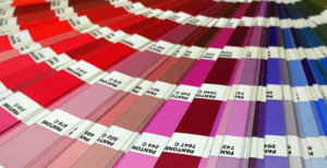
The Pantone Color System, developed by the Pantone company, is a standardized color matching system used primarily in printing, but also in other industries like textiles, plastics, and paint. It assigns a unique alphanumeric code to each color, making it easy to identify and reproduce accurately.
At its core, the Pantone system consists of a vast library of colors, each identified by a specific code. These colors are created using a precise blend of base inks, ensuring consistency across different print runs and materials.
How Does It Work?
- Color Identification: Every color in the Pantone system is assigned a unique code, such as “PMS 185 C” for a vibrant shade of red. This code consists of three parts: PMS (Pantone Matching System), the color number, and a suffix indicating the color’s finish (C for coated, U for uncoated).
- Color Reproduction: Printers can reproduce Pantone colors by mixing the base inks according to the specified formula provided by Pantone. This allows for precise color matching, regardless of the printing method or substrate used.
- Consistency: Since Pantone colors are standardized, they remain consistent across different print jobs, ensuring brand identity and design integrity.
How Can It Help You?
- Brand Consistency: For businesses, maintaining brand consistency is crucial for brand recognition and credibility. By using Pantone colors in branding materials, such as logos, packaging, and marketing collateral, you ensure that your brand colors remain consistent across various print applications.
- Color Accuracy: Designers and printers rely on Pantone colors to accurately communicate color preferences and expectations. Whether you’re designing a brochure, packaging, or signage, specifying Pantone colors helps ensure that the final product matches your vision.
- Color Matching: When exact color matching is essential, especially for corporate branding or product packaging, Pantone colors provide a reliable solution. By referencing Pantone codes, printers can reproduce colors with precision, minimizing discrepancies between design mockups and final prints.
- Expanded Color Palette: While CMYK (Cyan, Magenta, Yellow, Black) printing offers a wide range of colors, it has limitations, particularly in reproducing vibrant or specialty hues. The Pantone system expands the color palette, offering a broader spectrum of colors for designers to choose from.
In the intricate world of print, achieving accurate and consistent color reproduction is a fundamental aspect of quality craftsmanship. The Pantone Color System simplifies this process, providing a standardized method for color communication and reproduction.
Whether you’re a designer, printer, or business owner, understanding and leveraging the power of Pantone colors can elevate your print projects to new heights of excellence. Embrace the colors of possibility with Pantone!
Contact Us for More Information
Are you looking for a printer who can help you meet your deadlines?
Then your in the right place! Have any questions or concerns we would love to hear from you.
Please submit your information in this form and a sales professional will reach out to you.
Want to Speak to a Sales Representative? Call 770-424-2300