
How Viewing Distance Affects Font Size
Ever since the invention of the printing press, designers and publishers around the world have considered the proper font size for print projects. Even with the growth in popularity of electronic word processing capabilities, the font size of printed materials is still an important concept. In general, the font size shows how large the average character will be once it is printed on the choice of paper. While it is not hard to convert font size points to inches, the exact dimensions of a given character can still vary greatly when it comes from one font to another font.
Choosing the Correct Display Typeface and Font Size for Your Signage
When it comes to picking a font for a business, it is important for the font to be large enough that it is easy to read as well as legible. It helps to know a little bit about the characteristics of a font in order to properly pick the right font style and size.
The first characteristic of a font is the point size which refers to the maximum size of a box that the letters of the font will easily fit in. The box will extend from the letters with descenders that go below the line (common examples include “p” and “g”) along with ascenders like “b” and “d”. In the majority of fonts, ascenders and descenders will extend to the same length. While we will discuss common font size conversions below, a good starting point is knowing that one inch on paper is equal to 72 points. FYI: The letters will not always be a full inch but the space taken up by each letter will be no more than an inch tall.
When Determining How Viewing Distance Affects Font SizeSome common display typeface choices include:
- Lettering designs that look to be hand-drawn such as script fonts or designs with swashes.
- “Shadowed”, “engraved”, “inline” or “handtooled” lettering, with a blank space in the center, are designed to suggest 3D letters. Inline sans-serifs are an early genre of display type and they were very popular in lettering of the inter-war period. “Shaded” or hatched designs can have a gray appearance when viewed at a distance.
- Unusual or abstract redesigns of the alphabet include those drawn by the Bauhaus school of design or Indépendant.
- “Distressed” lettering, which is meant to look damaged or distorted, includes Shatter or Electric Circus.
- Ultra-light or ultra-bold adaptations of conventional letterforms, such as “fat face” types, can include Gill Kayo or Cooper Black.
- Mixed case lettering, which means it mixes uppercase and lowercase letters in unusual ways, are used when an unconventional effect is desired.
- Reverse-contrast typefaces invert the contrast of conventional writing and this means the horizontals are thicker than the verticals.
- Lettering that is made to suggest a particular aesthetic such as modernism or the natural world include the use of stencil or embossing tape fonts for an industrial aesthetic.
- “Mimicry” or “simulation” typefaces can suggest another writing system and they are quite popular with restaurants.
Understanding x-Height
Another important characteristic related to fonts is x-height and this describes the height of a lowercase letter without any ascenders or descenders (such as the height of a lowercase “x”). The letters in a font with a larger x-height look larger than the letters in a font that have a smaller x-height.
It is also important to keep the DPI for large print in mind when designing a banner. For example, a 72pt font with an x-height of 36pt means there will not be a letter that is larger than an inch tall. Plus, all lowercase letters without ascenders or descenders will be ½-inch tall. Many display typefaces intended for use at large sizes on signs and posters have high x-heights so they can be read clearly from a distance.
Font Size to Inches Conversion
Because of characteristics like x-height, the final font choice can affect size conversion. However, we have provided a good sampler for letter sizes below. Keep in mind not all letters take up the maximum amount of space allowed by the point choice. In other words, if you want the majority of your letters to look one inch tall, you need to choose a point size that is around 90pt.
- For lettering that is 1.5” tall, the font size should be 150pt.
- For lettering that is 2” tall, the font size should be 200pt.
- For lettering that is 5” tall, the font size should be 460pt.
- For lettering that is 10” tall, the font size should be 900pt.
A good general rule of thumb to remember is that a font size should be 30% larger than the actual point size you need. For example, if you want the majority of your letters to be one inch tall, you will need a point size equal to 1.3 inches or 90 pt font
Common Letter Height Recommendations
While it is important to keep the DPI for large format printing in mind so your signage will stand out, there are some general letter height range recommendations that can be applied to certain sign categories. When designing your sign or banner, and depending on how much text you have, these size ranges should be kept in mind:
- Yard and Political Signs: 5”-7”
- Roadside and Sidewalk Signs: 6”-12”
- Window and Storefront Signs: 8”-12”
- Traffic and Outdoor Wayfinding Signs: 10”-14”
- Retail Advertising and Special Event Banners: 12”-24”
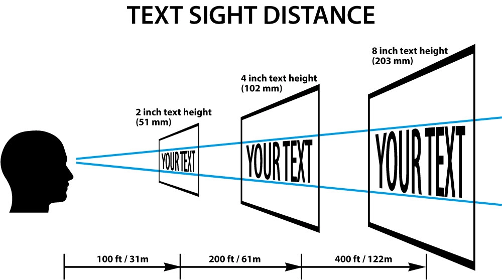
By keeping the viewing distance of signs in mind, you can more easily choose the right font size for an eye-catching, easy to read banner. When you are ready to print your banner, Graphic Solutions Group can help!
Contact Us for More Information
Are you looking for a printer who can help you meet your deadlines?
Then your in the right place! Have any questions or concerns we would love to hear from you.
Please submit your information in this form and a sales professional will reach out to you.
Want to Speak to a Sales Representative? Call 770-424-2300