
Riding the Breeze: Crafting Cool Printed Wind Mesh Fence Banners
In the world of outdoor advertising, versatility and durability are paramount. It’s not just about catching the eye; it’s about enduring the elements while conveying your message effectively. Let’s chat about a real game-changer in the realm of outdoor branding: wind mesh fence banners. These babies aren’t just your run-of-the-mill banners; they’re like the superheroes of outdoor advertising, with durability, wind resistance, and eye-catching designs that make them stand out in any crowd. So, grab a cup of coffee (or bubble tea, we don’t judge), and let’s dive into why these banners are the coolest thing since iced macchiato, along with some tips on how to design them like a pro.
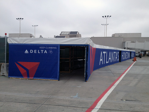
The Lowdown on Wind Mesh Fence Banners:
- Tough as Nails: These banners are built to last. Rain, wind, scorching sun – you name it, they can handle it. No more worrying about your message getting washed away or torn to shreds by Mother Nature’s fury.
- Wind-whisperers: Ever seen a banner flapping around like a wild flag in the wind? Not these bad boys. Thanks to their clever design with tiny little holes, they let the breeze pass through without losing their cool. Say goodbye to awkward banner dances and hello to steady, eye-catching displays.
- Pop, Lock, and Display: Don’t let their airy nature fool you; wind mesh banners pack a punch when it comes to visuals. With vibrant colors and crisp graphics, your message will be popping off the banner, grabbing attention from afar.
- Wherever, Whenever: From construction sites to concerts to sporting events, these banners are up for any adventure. Their versatility knows no bounds, making them the ultimate sidekick for your outdoor advertising escapades.
Tips for Designing Like a Pro:
- Keep it Clear: Make sure your message is crystal clear, even from a distance. Bold fonts and striking colors are your friends here. Think big and bold – you want your message to be seen and understood in a flash.
- Stay True to You: Consistency is key when it comes to branding. Stick to your brand’s colors, fonts, and vibe to keep things cohesive and recognizable. After all, you want people to remember you, not scratch their heads wondering who you are.
- Location, Location, Location: Think about where your banner will be hanging out. Consider the surroundings, potential obstructions, and angles to make sure it gets the attention it deserves. A little strategic planning goes a long way.
- Action, Please: Don’t leave your audience hanging – give them a clear call to action. Whether it’s visiting your website, joining an event, or just giving you a high-five, let them know what you want them to do next.
- What’s your hang up? Don’t forget grommets. Leaving room for enough grommets to secure your banners is as important as Taylor Swift at the Super Bowl (Sorry)! Also, don’t forget industrial strength zip-ties. There’s nothing worse than finding your banners on the ground next to broken Dollar Store zip-ties.
In summary, fonts play a vital role in print design, and selecting the right typeface is essential for effective communication. With Graphic Solutions Group as your printing partner, you can trust our expertise in printing that enhance your brand identity and make a lasting impression.
Contact Us for More Information
Are you looking for a printer who can help you meet your deadlines?
Then your in the right place! Have any questions or concerns we would love to hear from you.
Please submit your information in this form and a sales professional will reach out to you.
Want to Speak to a Sales Representative? Call 770-424-2300